May, 2024
ABSTRACT
This study employs factor and cluster analysis to evaluate nighttime walkability in Brooklyn, examining aspects such as lighting, land use, sidewalk conditions, street ratings, and crime statistics. By applying clustering techniques alongside a Bayesian network, we distinguished distinct neighborhood clusters, each with unique attributes that affect pedestrian walkability. The analysis exposed significant disparities in infrastructure and safety across the borough, underscoring the urgent need for tailored urban planning and interventions specific to each community. The insights gained from this research lay the groundwork for initiatives aimed at enhancing pedestrian environments and improving the overall quality of life for Brooklyn’s residents.
Keywords: Nighttime Walkability, Urban Planning, Cluster Analysis, Bayesian Network
INTRODUCTION
This study analyzes factors related to pedestrian walkability in New York city (NYC). The region of interest is defined to be Brooklyn, because Brooklyn has the highest percentage of crime arrests in 2023. Walkability safety is a major factor for people to decide whether to commute through walking or not. Factors related to walkability were defined as land use, lighting, which are especially important for nighttime walking; crime rate affects people’ choice of commuting; sidewalk density defines whether an area has enough walking space, and street ratings influence pedestrian movement patterns. By integrating data from various sources, it is necessary to see how Brooklyn is separated into different clusters, and what the characteristics are for significant clusters. Policy informs could be then suggested. The structure of this paper is segmented into seven parts in order: literature review, data description, methodology utilized, results, discussion, conclusion, and references.
LITERATURE REVIEW
Krambeck (1999) proposed the Global Walkability Index. This index defines ‘walkability’ through three core dimensions in safety and security, convenience and attractions, and policy support, which plays a critical role in assessing the pedestrian environments of urban areas worldwide.
Night pedestrian safety is a critical aspect of urban planning and transportation initiatives. Recent studies have focused on evaluating safety of people in night environments. For instance, Tamiru and Ponnurangam (2018) emphasized the significance of ensuring safe pathways for individuals with disabilities. Through data analysis, they identified key safety hazards for nighttime pedestrians and proposed actionable recommendations for improvement. Waite, Nelson, and Spinney (2023) demonstrated the positive impact of adequate lighting on pedestrian safety and comfort through a case study conducted in Cedar City, Utah.
In urban environments, Pollack et al. (2014) explored strategies to improve pedestrian safety by improving infrastructure and increasing night lighting. They noted that increased lighting in areas with high traffic was an effective means of improving the safety of pedestrians at night. Grijalva and Wellington (2015) highlight that maintenance work including road decongestion, maintaining signs, cleaning and rebuilding curbs, fixing lights, and clearing activities collectively enhance safety and accessibility of sidewalks.
DATA
- NYC land use data originates from the NYC Department of City Planning and is known as PLUTO (Primary Land Use Tax Lot Output). It provides comprehensive information including land use, building characteristics, ownership, and assessments for all 5 boroughs in NYC.
- Street lighting complaints, sourced from NYC's 311 service spanning 2010 to 2024, were categorized by zip code and street light location. This approach enabled the creation of a comprehensive distribution map of street lighting across the Brooklyn area.
- Street Pavement Rating provides information of street ratings in Good, Fair, Poor, and NR (non-rated) categories in NYC, and it also contains latitude and longitude each street segment.
- Crime arrest data is extracted on a quarterly basis and undergoes review by the Office of Management Analysis and Planning. Each record encapsulates an individual arrest in 2023 within all five boroughs of NYC. The dataset includes details such as the type of crime, and the specific time and location of enforcement.
- Sidewalk is sourced from NYC Open Data, which encompasses information on the sidewalk's shape, length, and geometry.
METHODOLOGY
1. Data Preprocessing
In order to analyze walkability related features in Brooklyn, the zip code data is filtered to solely contain zip codes within Brooklyn (11201 to 11256). Irrelevant columns such as ‘URL’, ‘SHAPE_AREA’, ‘SHAPE_LEN’, ‘BLDGZIP’, ‘COUNTY’, and ‘STATE’ are removed from the entire dataset to keep simplicity for further analysis.
It is noteworthy that the zip code ‘11231’ contains 2 parts. The data in the first part (row) was kept, but data in the second part was deleted because it primarily consists of a parking lot, which does not contribute significantly to walkability analysis.
1.1 Land Use Data
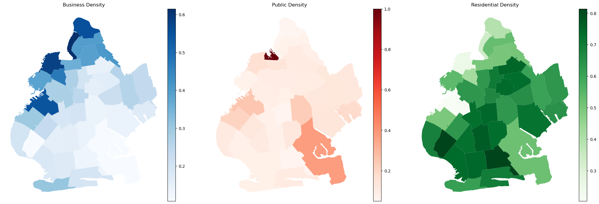
Land use data were broadly re-classified into residential, commercial, and public categories. GeoPandas was utilized for geographic data manipulation, Matplotlib for visualizations, and Contextily for basemap integration. Color-coded density plots were also used to illustrate the intensity of each land use category across Brooklyn, enhancing the understanding of spatial distribution.
1.2 Crime Arrest Data
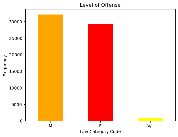
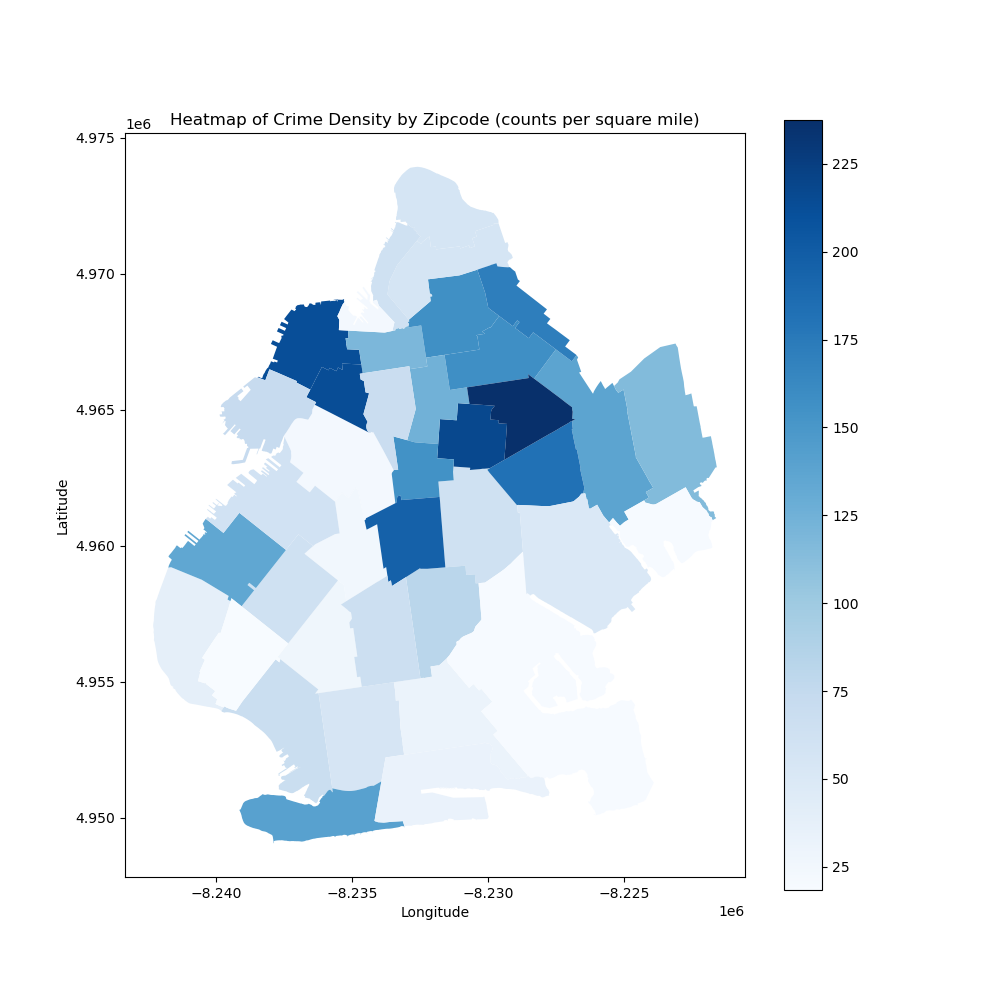
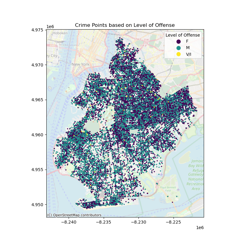
A pie chart performed by Matplotlib package was employed to see which borough has the highest crime rate. LAW_CAT_CD represents the law code of arrest count, and OFNS_DESC represents the more detailed classification of arrest data. Null values were filtered, and data with LAW_CAT_CD = '9’ were filtered out because there is no data dictionary for this column. Then this crime arrest data is merged with the zipcode file for map visualization. Matplotlib was then employed again to draw a map of Brooklyn in three categories: felony, misdemeanor, and infractions/violations, and heatmaps were drawn to show crime arrest counts per square mile in each zip code.
1.3 Street and Sidewalk Data
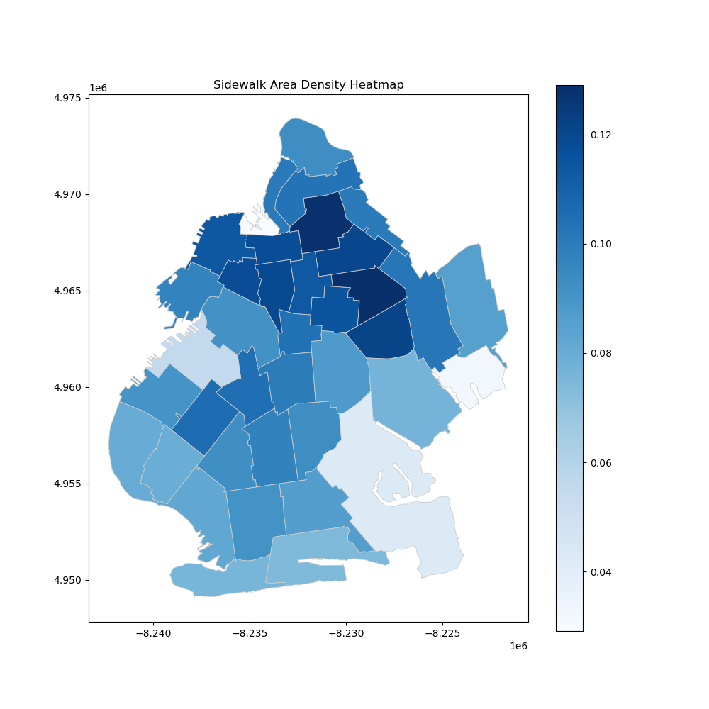
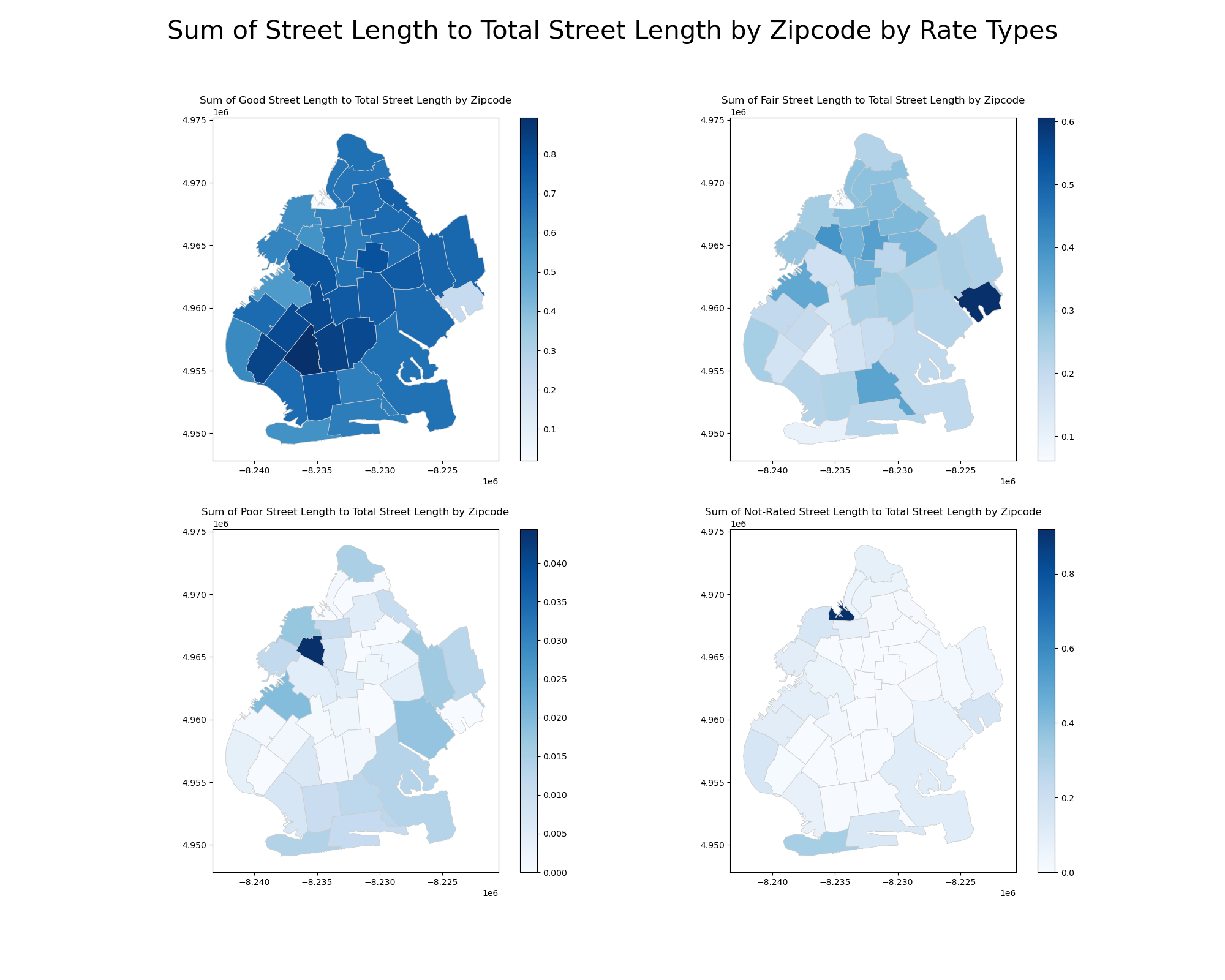
Data on Brooklyn's streets and sidewalks (preprocessed by ArcGIS Pro) were spatially joined. Then, the merged shapefile was dissolved by zip code, and the ratio of length of street (in feet) to total length per zip code is calculated for different street rating (poor, fair, good, nr). Sidewalk density is calculated by dividing the sidewalk area by the total sidewalk area in each zip code.
1.4 Light Data
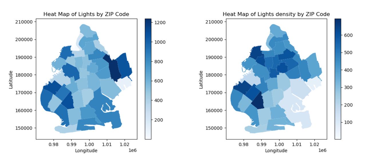
The light data extracted from 311 complaints was chosen. It was assumed that the long time-span complaints data contains most of the light record in Brooklyn. It was examined by assessing counts and density of street lights. The methodology for calculating density was dividing the total number of street lights by the geographic area of Brooklyn, measured in square miles. This approach allowed for a detailed understanding of areas with high frequencies of complaints, potentially indicating regions where street lighting improvements are necessary.
1.5 Integration
After all these processings, all data was merged using Python pandas and GeoPandas based on zip code. And their prefixes were renamed to better understand the column information.
2. Exploratory and Descriptive Analysis
2.1 Land Use
The visual analysis of Brooklyn’s land use reveals distinct spatial distributions across three main categories—business, family, and public. Business areas are concentrated in downtown and northwestern Brooklyn, reflecting their commercial emphasis. Residential zones are widespread, particularly in the central and southern regions, highlighting the borough’s residential character. Public land uses, such as parks and government facilities, are evenly distributed except the northwestern part of Brooklyn. These visualizations emphasize the spatial concentration of various land uses across the borough.
2.2 Crime Arrest Count
The crime arrest data from Brooklyn was analyzed and classified according to severity, which included felonies, misdemeanors, and violations/infractions. The maps visually display the distribution of these categories. And the crime arrest density calculated by crime arrest count divided by area in square miles per each zip code to check the crime arrest frequency spatially.
Areas with a high concentration of felony offenses, represented by the color purple, suggest the need for increased policing efforts in these regions, especially for the most appearance in the northwestern region. Misdemeanors, indicated by green dots, are extensively dispersed throughout the borough, illustrating the prevalence of minor offenses. Yellow marks indicate violations or infractions that occur more regularly in certain places, while they are less frequent overall.
2.3 Street and Sidewalk
The analysis of Brooklyn's infrastructure assesses sidewalk density and street ratings across zip codes. The sidewalk heatmap shows a large proportion of walking area by looking at the density. And the street length ratio maps categorize streets into good, fair, poor, and not-rated ratings, revealing that well-maintained streets are mostly in southwestern region of Brooklyn. These insights highlight disparities in infrastructure maintenance and investment across Brooklyn.
Figure 3. Sidewalk Area Density in Brooklyn
2.4 Light
In the graphical representation of street lighting, a higher concentration of lights is observed on the eastern and southwestern sides of Brooklyn. However, upon calculating the density of lights per square mile, the northern and southwestern areas of Brooklyn exhibit greater values. A noteworthy point is that some areas like the east and southeastern sides, have higher counts of lights but lower density.
3. Machine Learning Modeling
3.1 Clustering
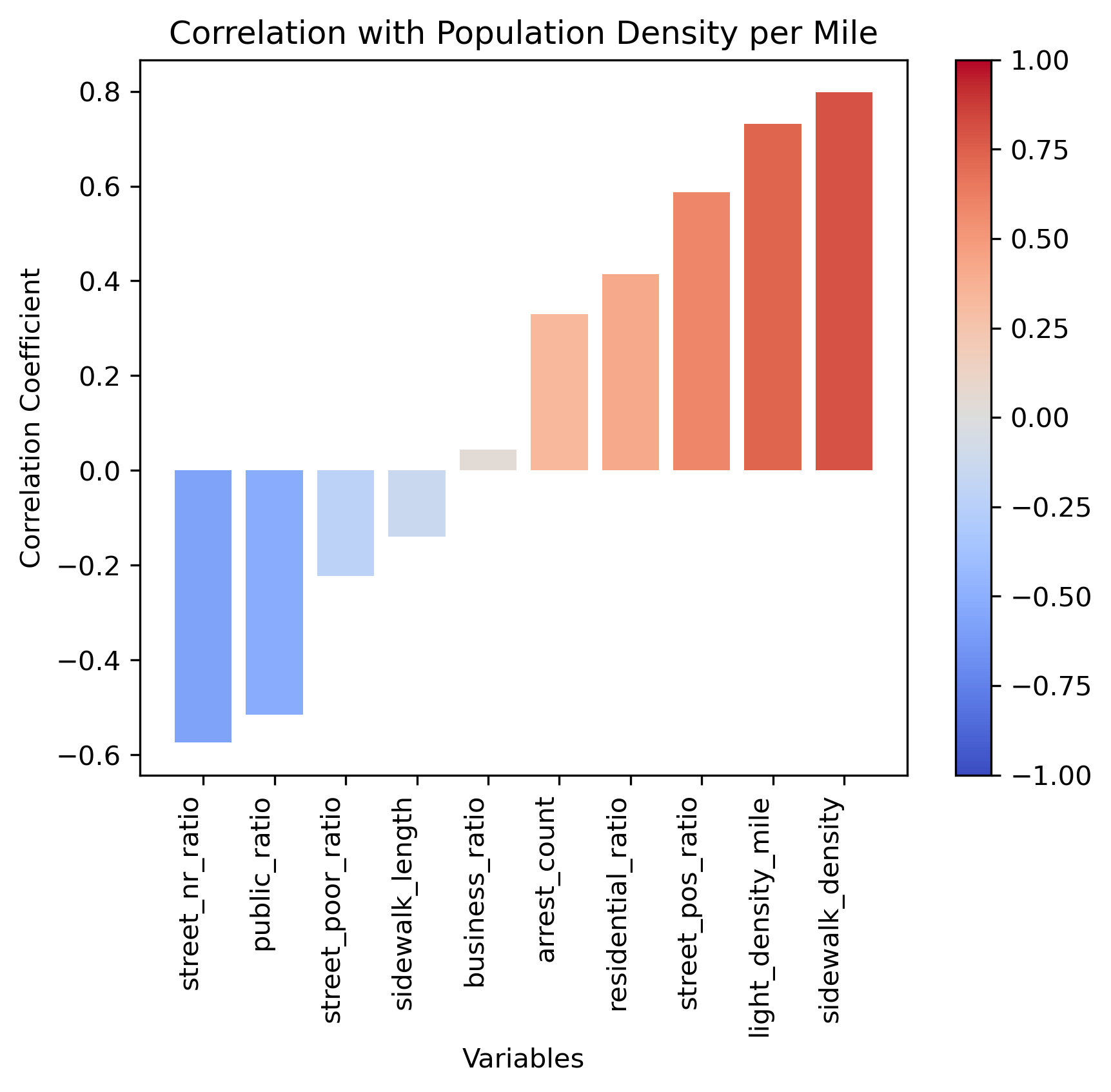
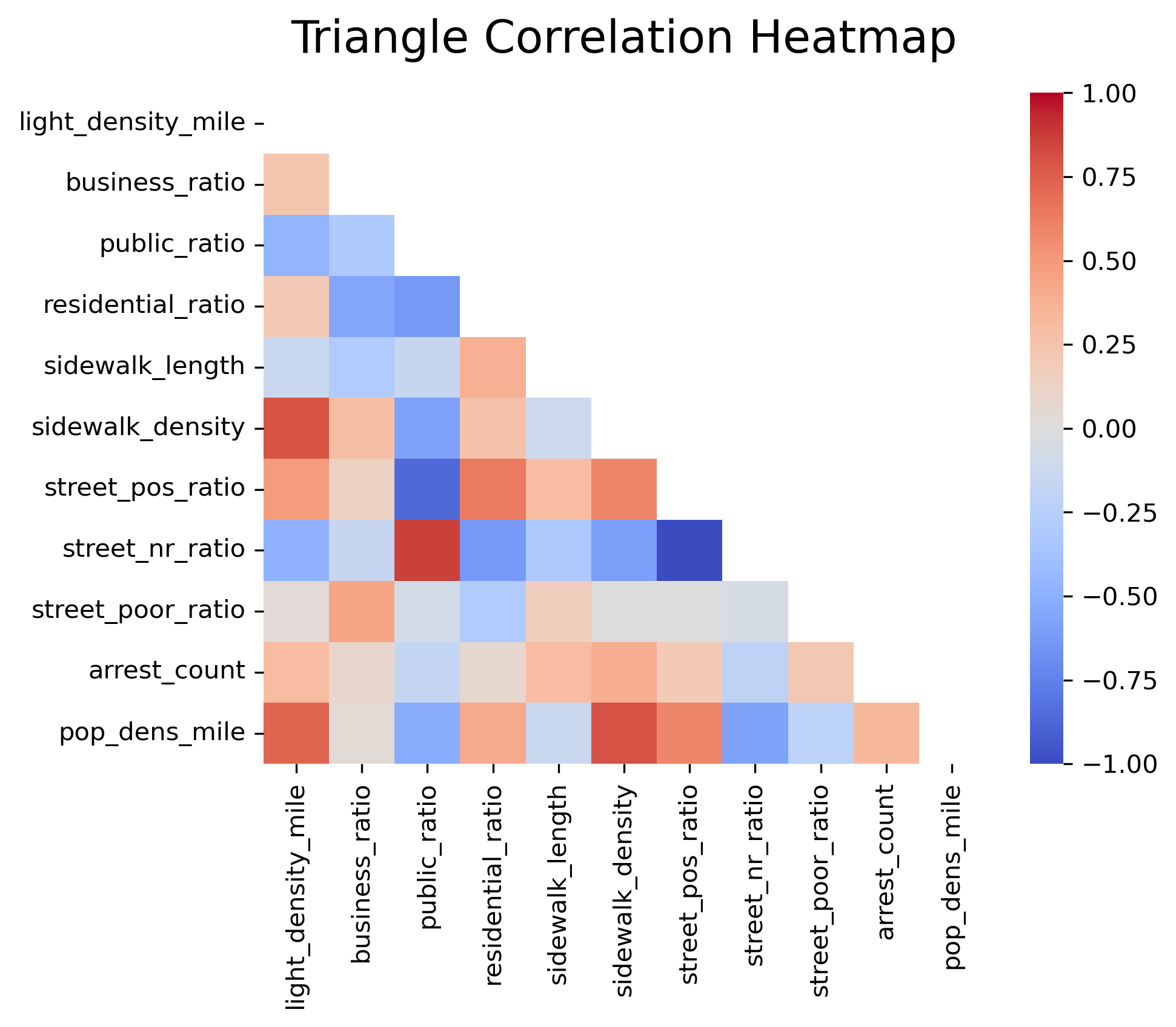
The purpose of applying cluster analysis is to reveal different patterns of pedestrian walkability-related factors in Brooklyn. Selected features include the number of light density per square mile, ratio of business land use across all land use, ratio of public land use across all land use, ratio of residential area across all land use, sidewalk length, sidewalk density, street has positive rating total length to all rating length, arrest counts, population density (per square mile). These variables were chosen because they elicit the best clustering performance after conducting multiple trials of testing. All data points are normalized before clustering to ensure equal weighting of each feature.
K-means Clustering: Data is grouped using the K-means algorithm, categorizing plots based on selected features. The silhouette score is used as a metric to determine the optimal number of clusters (K-value).
Gaussian Mixture Model (GMM): Clustering is then performed using GMM, which assumes that the data is composed of mixtures of several Gaussian distributions. Unlike K-means’ hard clustering (where each point belongs to one cluster), GMM provides probabilities for each point belonging to various clusters, making it a soft clustering method. The silhouette score is also used to evaluate the clustering effect of different numbers of Gaussian components, selecting the best model parameters.
3.2 Bayesian Network
Bayesian network modeling with pgmpy captured interdependencies among walkability factors, including zip code and all clustering features. This inclusion of 'zipcode' aims to explore both the relationships among factors and their geographical correlations.
RESULTS
Differences in Regional Clustering Characteristics
K-means Clustering Results and Visualization
From the K-means clustering visualization, the entire Brooklyn area is divided into two clusters: Cluster 0 (colored purple) covers the vast majority of the area, while Cluster 1 (colored yellow) encompasses a very small area. This distribution is highly unbalanced. For the K-means method, the silhouette score reaches its highest at 0.6753 with 2 clusters. Although this high score indicates good homogeneity within clusters and separation between clusters, the extreme imbalance in clustering suggests that this method may not have captured the complexity and diversity of the Brooklyn clustering effectively.
Figure 5. Community Distribution Map of Different Clusters
Gaussian Mixture Model (GMM) Clustering Results and Visualization
The GMM clustering visualization shows seven clusters. The distribution of these clusters across the Brooklyn map is more diverse, reflecting different geographic and socio-economic characteristics. The GMM method achieves its best silhouette score of 0.2689 with seven clusters. While this score is lower than the highest score of K-means, it shows a more balanced distribution and detailed granularity.
Correlation Analysis
The correlation is studied for features used in clustering. It is noteworthy to see that streets with no rating ratio are inversely related to street positive ratio, streets with no rating ratio have positive correlation with public land use ratio, public land use ratio is negatively related to street positive rating ratio, population density per square mile is positively related to light density per square mile, and sidewalk density per zip code.
Social Demographic Patterns by Clusters
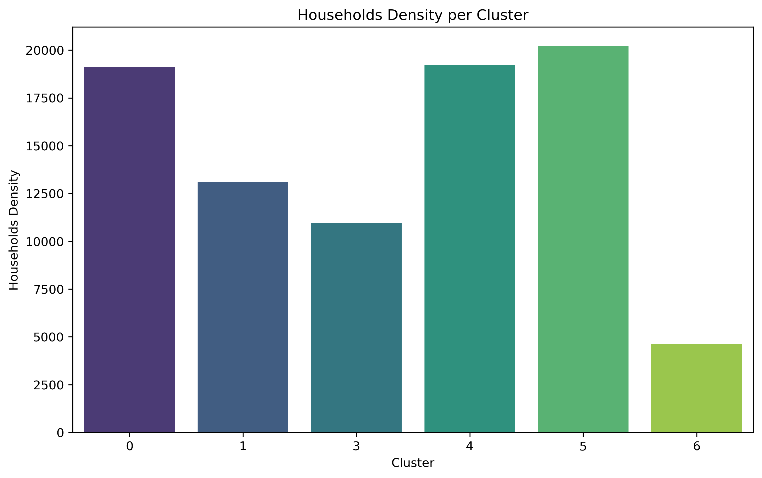
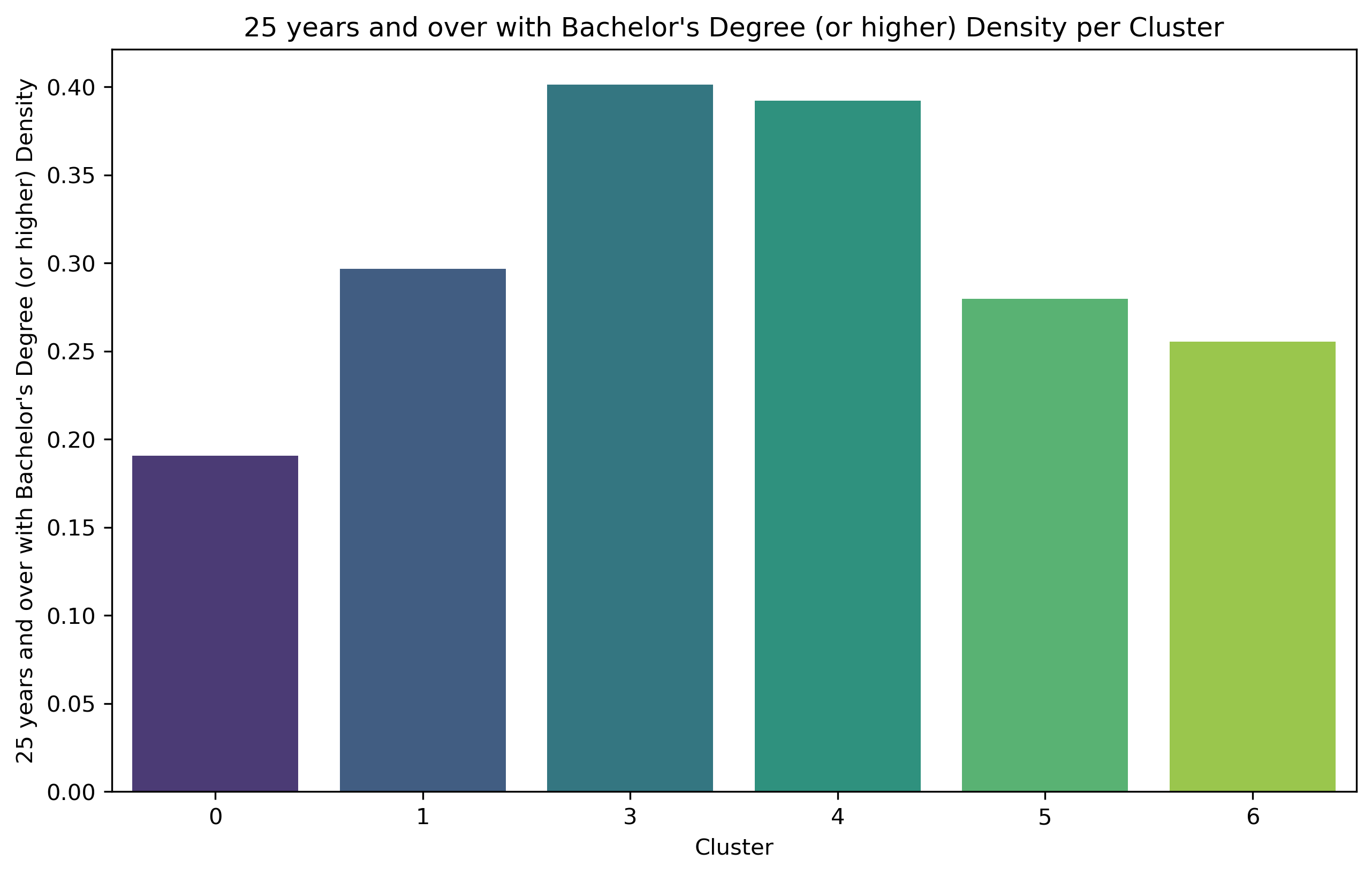
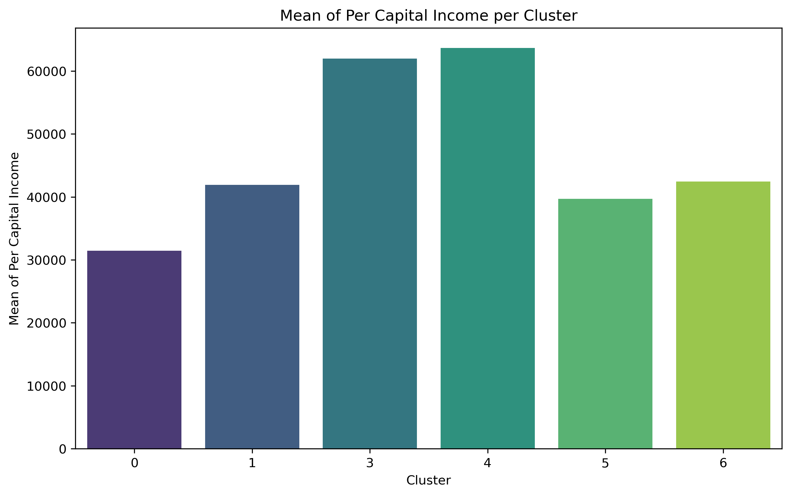
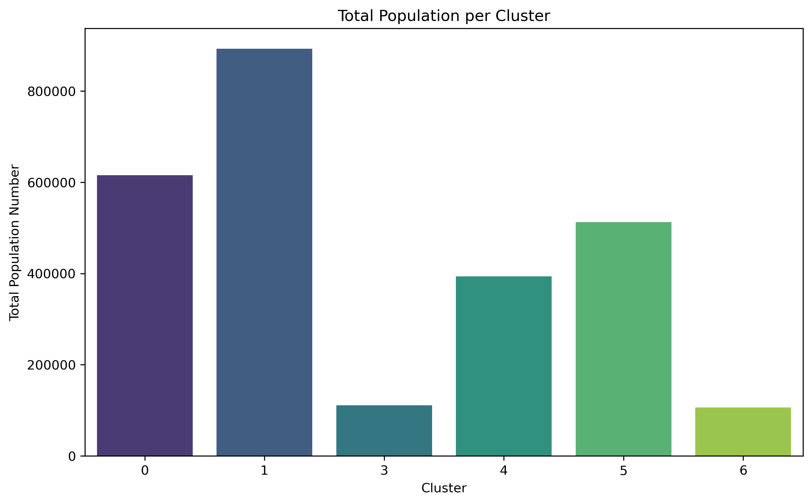
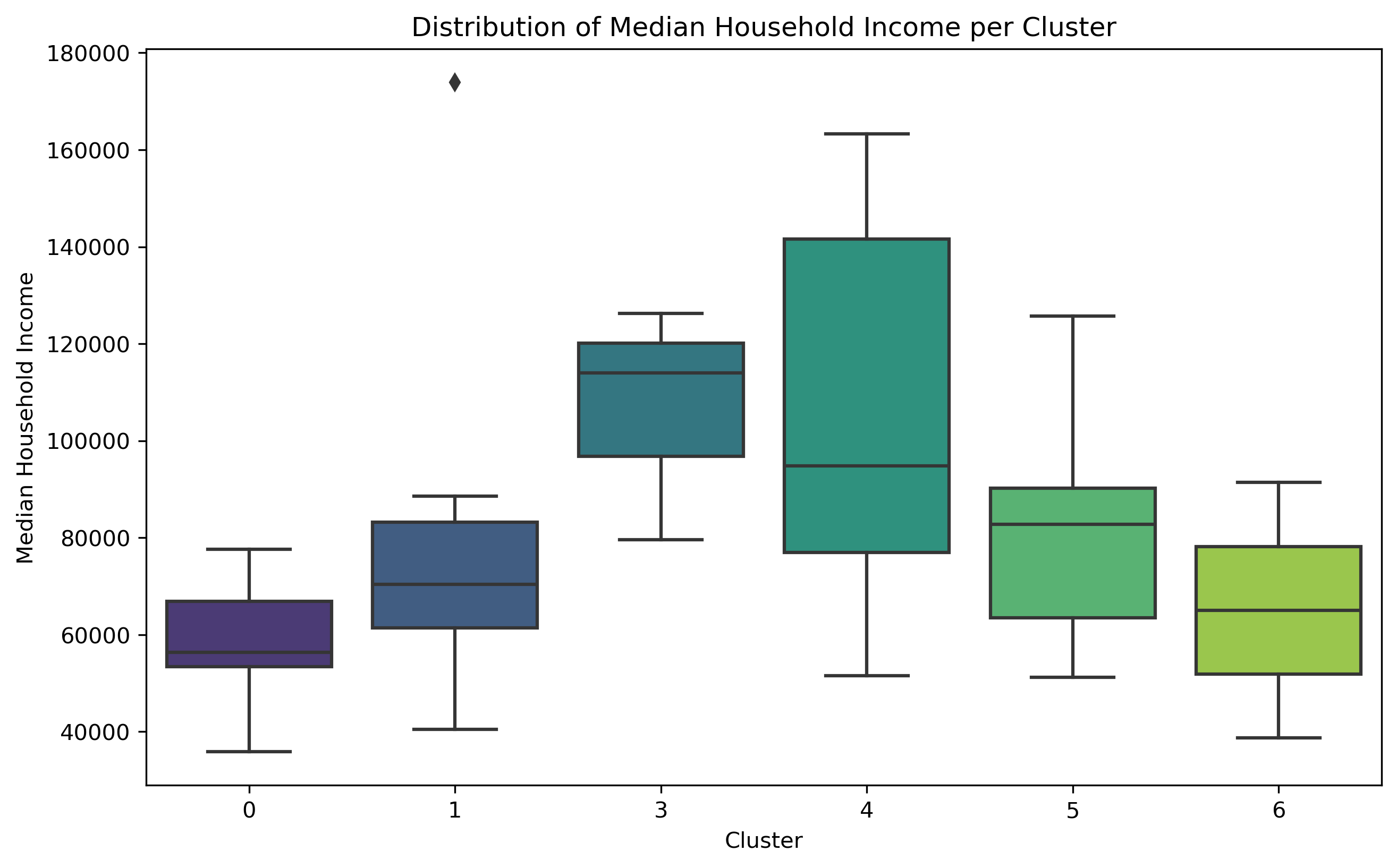
The analysis of social demographic factors, such as households density per square mile, population distribution, disability counts, commuting types, mean or median population income are used to determine their relationship on walkability in seven clusters identified by the GMM algorithm. Given that Cluster 2 consists of only one zip code from clustering, and was deleted because of NaN data, it is not analyzed in the following part.
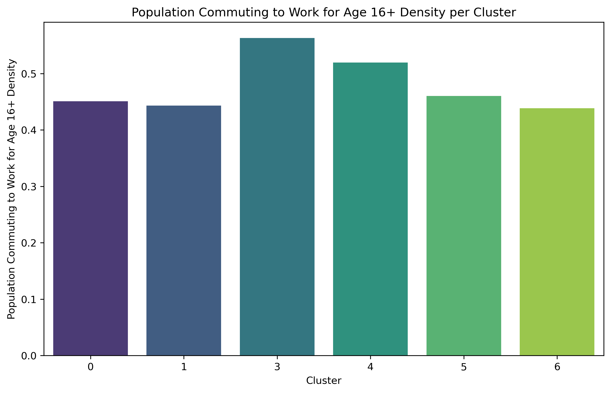
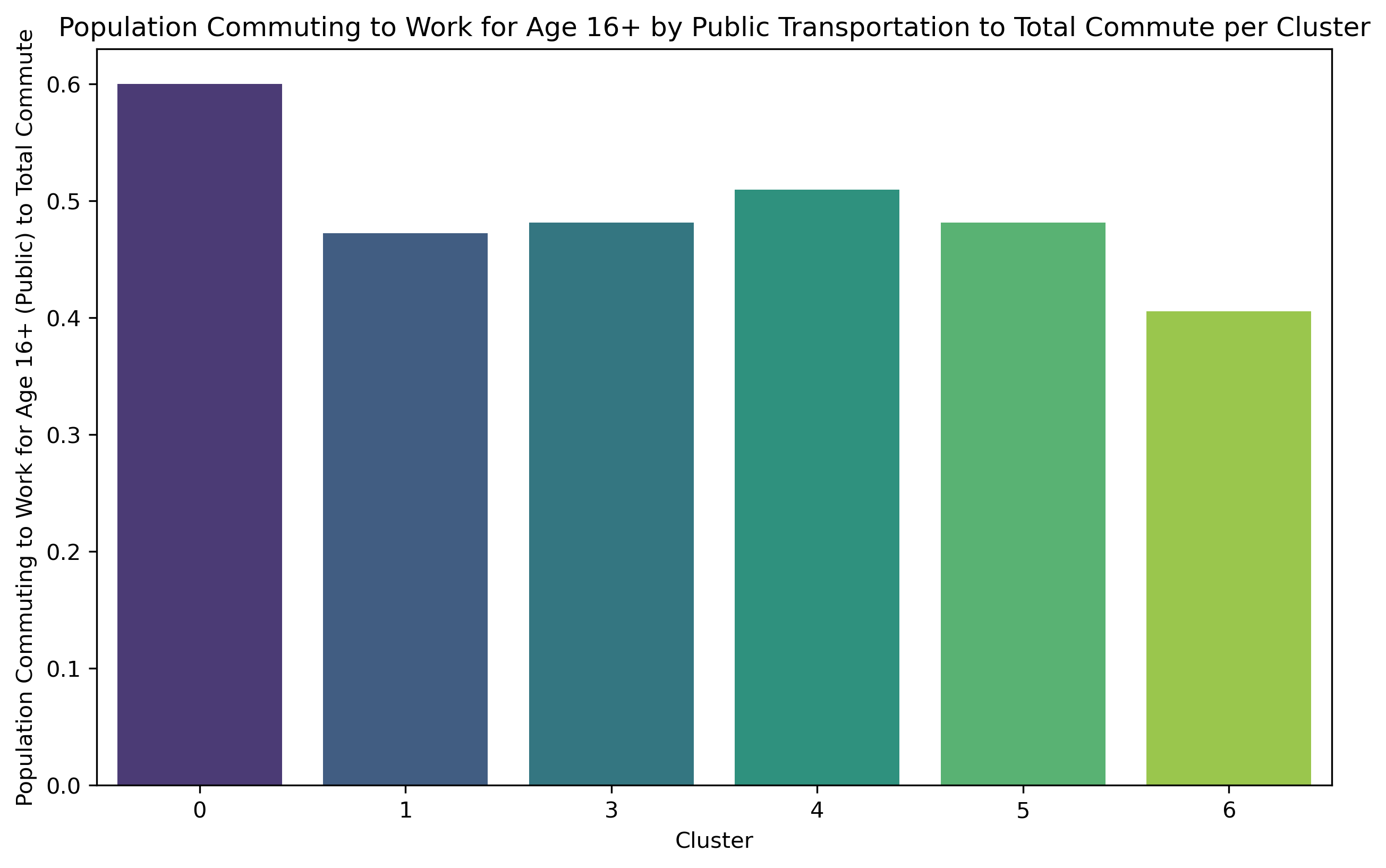
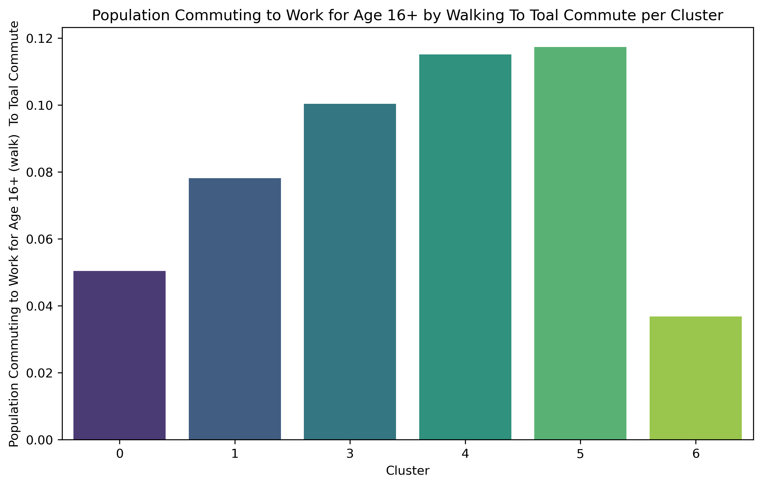
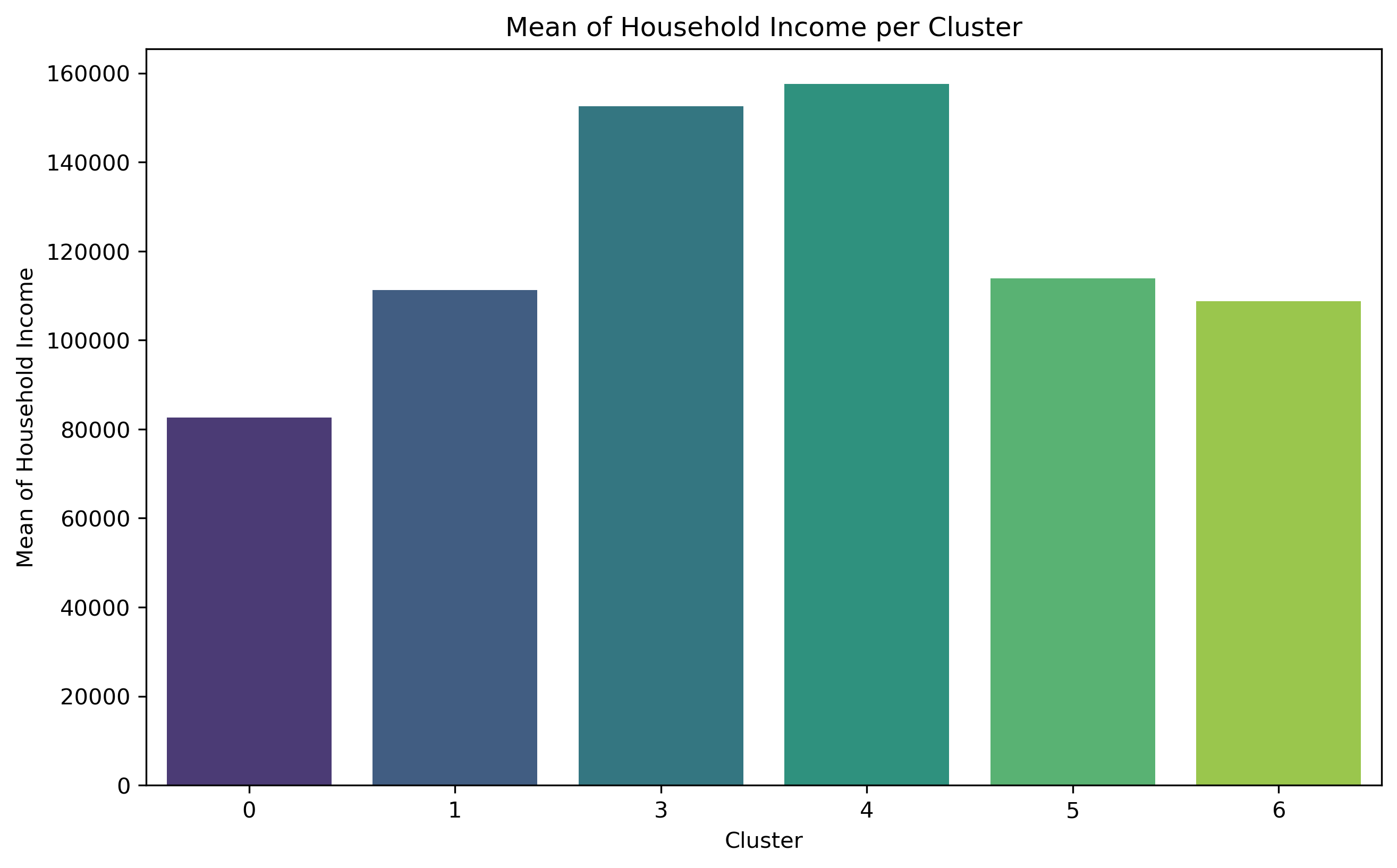
Cluster 0 exhibits a relatively high concentration of households and population size, but with the lowest level of education. Out of the entire population of commuters, Cluster 0 has the largest percentage of individuals who use public transit to go to work, although comprising less than 50% of the total population. This cluster exhibits the most minimal median and mean income.
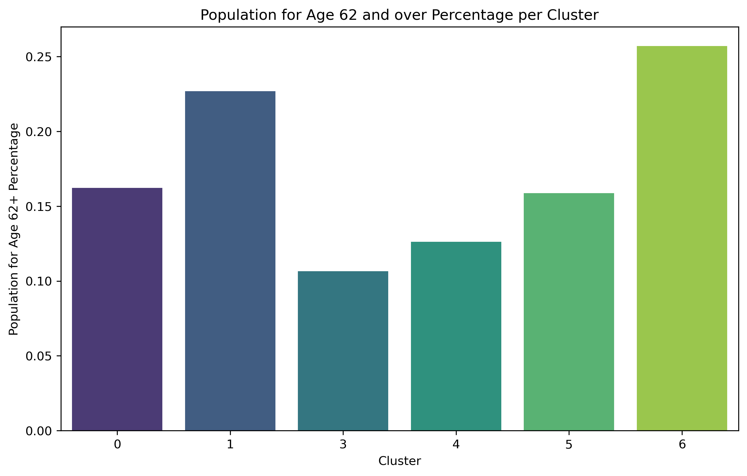
Cluster 1 comprises 33.9% of Brooklyn's total population, making it the largest cluster among all. Additionally, it includes a significant proportion of individuals aged 62 and above. Nevertheless, the population with the biggest number of individuals does not exhibit the highest concentration of households.
Cluster 3 shares a comparable population percentage (4.2%) with Cluster 6, but it stands out for having a far higher concentration of households. It also has the largest proportion of people who commute to work. Cluster 3 exhibits the highest median income compared to all other areas, and it ranks second in terms of mean income.
Cluster 4 exhibits a notably higher concentration of households and a larger population compared to Cluster 3. Cluster 4 has the second largest proportion of individuals who choose to walk to work among all commuters. It also has a substantial variation in the range of median household income. This cluster also has the highest mean income.
Cluster 5 exhibits the greatest density of households compared to all other clusters. Additionally, within this cluster, the biggest proportion of individuals among all commuters who go to work by walking.
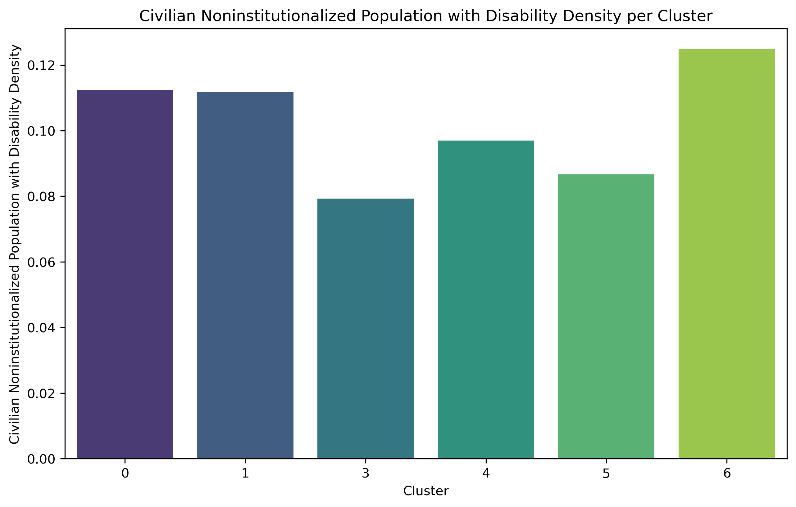
Cluster 6 exhibits the lowest household counts per square mile and the smallest population size (4.0%) compared to other clusters. Nevertheless, these areas are experiencing population aging as they have the largest percentage of individuals aged 62 and above. And it has the greatest percentage of disability.
Bayesian Network
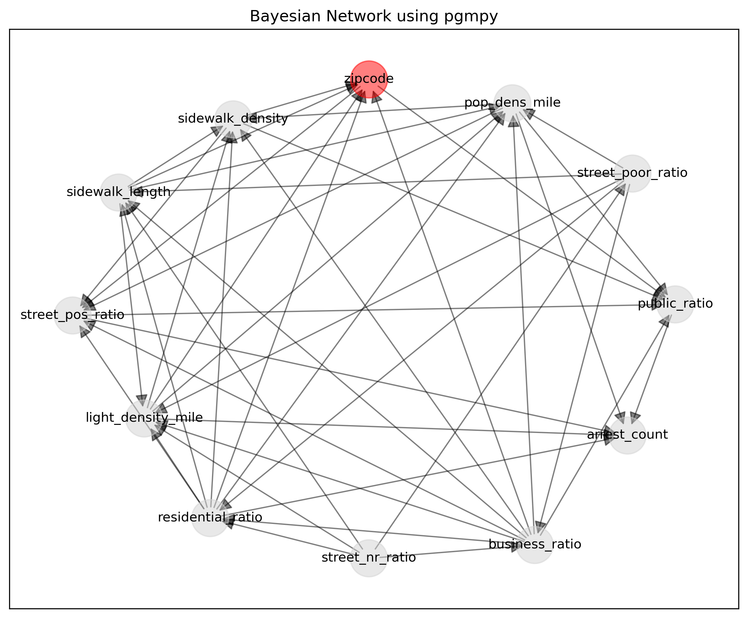
The Bayesian network analysis conducted using the Python ‘pgmpy’ package reveals interdependencies within urban factors related to walkability. Zip codes appear to correlate with street positive rating ratios and public land use ratios, suggesting a potential geographical influence on community attributes. Moreover, population density per square mile emerges as a key factor impacting crime arrest counts and public land use ratios. Furthermore, variables like residential land use ratios, street positive rating ratios, and light density per square mile contribute to crime arrest counts, shedding light on the geographical and infrastructure impacts on crime arrests. These findings underscore the complex interplay among land use, street ratings, sidewalk features, crime arrests, population and zip code, which are all related to walkability.
DISCUSSION
Examining the unique qualities of every cluster in detail reveals a number of important findings. First off, while there is a high household density in both Clusters 0 and 5, their commuter patterns are different. Walking is the most common method chosen by commuters in Cluster 5, whilst public transit is preferred by those in Cluster 0. Cluster 0, characterized by a high crime rate and moderate lighting density, may deter walking commutes. Conversely, Cluster 5 boasts well-rated sidewalks and a lower crime rate, making it more conducive to walking.
Clusters 4 and 6 also offer significant insights. Cluster 4 has a high prevalence of crime arrests, which raises safety concerns despite the high sidewalk density and large number of commuters. To solve this issue, policy measures like stepping up police patrols at night may be necessary.
Furthermore, Cluster 6, characterized by its sparse population and numerous green spaces, predominantly houses an elderly and disabled demographic. Under these circumstances, the area may attract a significant number of residents from other areas to utilize the parks. Therefore, constructing facilities to connect public green spaces with the surrounding residential areas becomes essential. These should include continuous jogging paths, bike-only lanes, and clear directions to the parks. Among these supportive designs, features that cater specifically to the elderly, such as more ramps instead of steps and the implementation of armrests along the walkways, may be necessary in these cluster areas.
Based on the direction graph from Bayesian Network, relations could be found related to walkability to inform policy. For example, poor-rating street ratio impacts both residential land use ratio and business land use ratio, building and maintaining better streets could attract business activity. Sidewalk and light density are correlated, suggesting the importance of improving both light density, like installing more LED bulbs on sidewalks to increase illumination, and increasing sidewalk area, by both width, length, to increase walkability.
LIMITATION
This study examined walkability factors in Brooklyn, including sidewalk area, street ratings, crime data, lighting, and land use, but initially did not assign specific weights to these factors. Future research could be conducted to build a model and to predict by surveying nighttime walking based on realistic weights. Additionally, our analysis was limited by the lack of a detailed street light database. Incorporating a comprehensive street light database in future research could enhance analysis precision and urban planning.
CONCLUSION
This study provides an in-depth analysis of the factors affecting nighttime walkability in Brooklyn, utilizing a comprehensive dataset encompassing land use, street lighting, sidewalk infrastructure, and crime rates. Our findings indicate that walkability is highly influenced by a blend of infrastructural and socio-economic factors, which vary significantly across different Brooklyn neighborhoods. We identified distinct clusters within Brooklyn using GMM, each demonstrating unique characteristics that related to mobility. Notably, disparities in crime arrest counts, lighting adequacy, street ratings, and sidewalk conditions suggest targeted areas for improvement. The Bayesian network analysis further highlighted the interdependencies between urban factors and walkability, emphasizing the internal connection of walking factors. Overall, this study underscores the need for tailored urban planning strategies that address the specific requirements and challenges of each cluster, enhancing walkability and thereby improving the quality of life for Brooklyn residents. Future research should consider a more detailed street light database and the integration of community feedback to refine the understanding and enhancement of walkability in urban settings.
REFERENCE
Krambeck, H. V. (2006). THE GLOBAL WALKABILITY INDEX. https://dspace.mit.edu/handle/1721.1/34409
He, X., & He, S. Y. (2023). Using open data and deep learning to explore walkability in Shenzhen, China. Transportation Research Part D: Transport and Environment, 118, 103696. https://doi.org/10.1016/j.trd.2023.103696
Ki, D., Chen, Z., Lee, S., & Lieu, S. (2023b). A novel walkability index using google street view and deep learning. Sustainable Cities and Society, 99, 104896. https://doi.org/10.1016/j.scs.2023.104896
Gitelman, V., Balasha, D., Carmel, R., & Hendel, L. (2012). Characterization of pedestrian accidents and an examination of infrastructure measures to improve pedestrian safety in Israel. Accident Analysis & Prevention, 44(1), 63-73.
Grijalva, G. & Wellington, O. "Plan de mantenimiento vial de la avenida pajonal desde la calle Arizaga hasta la calle 12 en la ciudad de Machala Provincia de el Oro."
Pollack, K. M., Gielen, A. C., Mohd Ismail, M. N., & Mitzner, M. (2014). Investigating and improving pedestrian safety in an urban environment. Injury Prevention, 20(1), 1-6.
Tamiru, G., & Ponnurangam, P. (2018). Investigation of pedestrian safety - a case study. International Journal of Civil Engineering and Technology, 9(11), 2227-2236.
Waite, S., Nelson, I., & Spinney, J. (2023). Walking After Dark: A Sidewalk Illumination Case Study in Cedar City, UT. American Journal of Undergraduate Research, 20(3), 1-10.
APPENDIX